As an illustrator, it is crucial to use different marketing strategies to advertise creative products, merchandise and commissions. For example, some may promote deals such as discounts to gain more traction and attention to their website. One marketing strategy that I have begun to use is tiktok and instagram. Both these social media websites can be used as an effective promotional tool and connect to other creatives online.
I personally really enjoy creating videos to advertise my talents. Especially with documenting my process and progress with different drawings. I have provided an example below. This video was quite simple to create and with selecting a trending song. It gained more followers and popularity on social media sites.
But there are other different ways marketing can be used within the creative industry. This can be used through logo, posters and word of mouth. Despite word of mouth, can be a very slow marketing technique. It doesn’t mean that this technique is completely useless. It can show that the person is trustworthy and safe. Which is why I am trying to implement this and other marketing strategies.
Enclosed is some examples of my previous logo design projects
In today’s society, AI has become an increasingly important issue amongst organisations, businesses and creative individuals. The debate between ethics of AI and the creative industry has been ongoing for several years. Especially with the introduction of AI art and photography. In recent years, AI has developed software to recreate paintings in specific styles, generate visual ideas and collecting photos to form a complete visual artwork. With the growing advancements of technology, it is important to discuss the positives and negatives of AI in the creative industry. Does AI still have a place in the creative industry or should it be ignored?
As a creative myself, I’ve observed the benefits of AI, especially with generating ideas, supporting character design in animation and picturing key concepts. For example, creatives can use AI to imagine how their work would look or developing their own persona online. Either that b, an online presence or a character in a game. AI can provide valuable insights into designing different things, regardless if the individual processes any artistic talent. Isn’t that just amazing? If a creative wanted to capture a girl holding a flower, then AI could be used to gather references and inspiration on different proportions, size and any potential design elements. In turn, gathering artistic inspiration helps artists progress and develop their own specific style. Which I would argue, to be a benefit of AI in the creative industry.
However, some consider AI and its software to be a threat to the creative community. Creatives including artists and photographers assume that the growth of AI art could lead to less deals with potential clients and consequently lead to job losses in that market. These fears are understandable, especially when AI art is very cheap to create and requires less time. No wonder creatives are worried! Too many creatives worry that the growth of AI art can cause their own work to be devalued and unrepresented. Especially where everything and anything is more valued online. Already traditional art has become devalued in recent years due to the growth of digital art and now AI art. Mainly due to time constraints and cost.
Is there anything that can be done? Should we as creatives expect AI or should we turn a blind eye? Personally, I believe that AI isn’t necessarily a bad thing, that should be avoided at all costs. But rather we should judge AI in art based on what the intentions are. For example, if an AI designs a drawing that directly copies another creative. Then yes, this would considered to be a bad use of AI in the creative field. But what if an artist wants to use AI for the purpose of gathering referencing and picturing key concepts? Then, likewise the creative should not be slandered for using AI for support. Overall, I believe that AI should be used in a way that doesn’t harm the creative industry. But rather works in partnership to support the growth and development of the creative industry.
Like many artists, I struggle with the expectation of a style. I try many from colour to line art, and I still find in my third year of illustration trying to do them all.
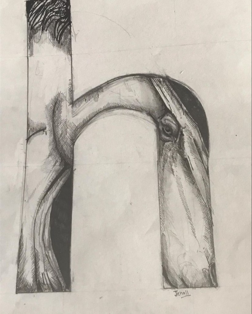
Hedgehog – jessica hall
But, I personally think the way artists and illustrators should develop a style Is through practice. Drawing from photographs and life is important realisation for developing a style as an artist. But most importantly, drawing artists as inspiration. I am inspired from many artists , from John tenniel to Andy Warhol.
Hello fellow illustrators and graphic designers and welcome to another blog. Throughout the connections course, I have interviewed quite a few illustrators and graphic designers. Andres Lozano, a Spanish illustrator living in the UK. Lozano is known for his playful and humorous illustrations, with personal style surrounding colour. Thank you Andres Lozano for this email correspondence, it has been very insightful and interesting to read. If you are interested in contacting Andres Lozano, here is his website.
Gear by Andres lozano
1) Who inspired you to become an illustrator?
AL: “No one in particular but the publications published by Nobrow books in their first years of activity, especially Nobrow magazine where really influential.”
2) What was it like illustrating the life earth ocean book with wide eyed publishers ? Did you approach them or did they approach you? ‘
Life On earth – Ocean by Andres Lozano
Al: “I’ve worked with Wide Eyed in numerous books including those series you mention and it’s always been a great working experience, I think our first contact was a meeting set up with my agents”
3) What other materials would you consider working with in the future?
AL: “I don’t really limit myself to specific materials, so anything is possible.”
4) How did you get approached by newspaper and magazine companies? was there a particular piece in your portfolio they particularly liked?
AL: “It really depends, sometimes I approach a particular art director and sometimes it is the other way around, often they will have one or several examples from my portfolio that they liked.”
5) What do you hope people will take away from your illustrations ?
AL:”I hope people will connect with them and feel immersed in the world I’m trying to create.”
6) How do you deal with difficult clients?
AL: “My agents at Folio really help, but sometimes you just have to stand for yourself. It’s rare but I’ve had cases where I’ve cancelled a project If the client was being too difficult.”
7) I really enjoy ancient and material world. What inspired you to create these illustrations? What experiences did you gain from creating them?
Ancient and medieval by Andres lozano
AL: “I think you are referring to a few spreads off “Human World”, a book I illustrated for Wide Eyed Books. It was quite an intense project as it was a lot of work and not a lot of time but pushing your own limits is always interesting.”
8) What art medium do you prefer working in ?
AL: “For illustration I work mostly digitally or ink on paper.”
9) Which project or influences has been important with developing your personal style? How long did it take to find your personal style?
AL: “I don’t really believe in the concept of personal style, I think that If you create enough work, through time your own personality and influences will start to show and materialize into a unique perspective.”
10) Which project has been the most rewarding and which one was the most challenging?
AL: “I couldn’t really tell you any specific one, it’s always rewarding when the client trusts you and let’s you try new things.”
11) What do you like about creating and designing book covers? Did you always want to create book covers from the beginning of your illustration career?
AL: “I haven’t really done many book covers unless you include the ones for books I’ve also illustrated in full, in those cases I try to encapsulate the content and style of the book.”
12) Colour seems quite important in your illustrations. How do you decide the colour placement?
AL: ” I tend to work with a limited palette that then I overlay to create new colors.”
13) What is the best advice you have learnt over the years, that helped with your illustration career? I couldn’t tell you any specific piece of advice but in general I find harsh, honest criticism to be really helpful, although sometimes a bit painful too.
14) When did you decide to become an illustrator?
AL “In my second year of university, I wanted to make comics before that but I found illustration was a better fit for me.”
15) How long does it usually take to create murals? Which has been your favourite mural to create?
AL “It really depends on the size, but for example the one I created for the “Hat Weekend” in Sao Joao de Madeira in Portugal, which might be my favourite, took around 5 days.”
City Break by Andres Lozano
16) What advice would you give to future illustrators?
AL “Don’t worry too much about style and try to create work that is uniquely yours by drawing a lot and embracing the things that connect with you. I find that when you start as an artist there’s a tendency to leave behind all the things that you enjoyed growing up and inspired you to become an artist in the first place and instead take on a more edgy or “interesting” persona, this is natural and happens to everyone but the faster you accept your inner kid and embrace the things that make you who you are the better your work will be and the more you’ll grow as an artist.”
As part of the illustration connections module, our last blog focused on connecting with the careers development centre at the University of Derby. This particular blog was optional, but I decided to write my responses after the appointment. I got some very positive feedback regarding my cv and portfolio. Though there are elements that I definitely need to improve upon, including spelling and important features not to include within the CV. I will improve the CV with connecting the spelling and constructing the CV more clearly as advised. Throughout the discussion I was encouraged to write a skills cv rather than one based on experience. As currently I have very little experience with working in an agency. This therefore would encourage me to look further into working in an illustration agency over the summer. To help gain further experience and develop the content of the CV.
I did get quite a few job recommendations suggestions, including the illustration company Twinkl and other art organisations, which I will definitely look upon. Twinkl is a children’s book publishing agency based in Sheffield, but works and teaches with children to encourage learning and development. I really like the idea of emailing Twinkl, as I do find that my illustration career will direct itself to a more children’s book approach. From the conversation from Val, I was also inspired to look for job opportunities within Derbyshire. I have examined different companies, specifically the planet illustration, which I will definitely contact further.
Overall, the feedback was positive and I will try and find the relevant experience necessary to further strengthen and promote my CV, as an illustrator.
So far the illustration connections course has been a very positive experience, especially working with other graphic designers and illustrators. But after weeks it has finally come to a close, where we did our group presentations. After presenting our final presentation, our group received feedback on what we could improve on and what was deemed successful. This feedback helped illustrate our progression and allowed us to accept ideas and opinions of others.
For the Orrery, was deemed quite successful from the module leaders, especially relating to positioning within the space. Though the module leaders did suggest that it was the projection idea, not the Orrery that would attract younger people in terms of an instagramble approach. But loved both ideas regardless. I personally loved the comments regarding the prospect of an Orrery. I felt as a group project that this was quite successful, as provided by rigorous planning and determination. Though there were a few harsh criticisms that were not mentioned in the previous draft pitch, which honestly we would prefer it was mentioned then. We would start to adjust these requirements had they had been at an early date. But despite the harsh criticism, which we will fully review, it has come to my intention that group effort as a whole, was quite successful.
My practice sketch for the deckchair design
The next part of our proposal situated on the appearance and look of the space. For which there was no major problems. However they did suggest that we make the space look ‘too – cluttered’ , because there were so many ideas that we were presenting to the museum. Admittingly I have to agree that we should of furthered and strengthen links between the different elements of the Joseph Wright exhibition. The ‘too cluttered’ response was added to the additional features such as the light boxes. However, I did think the light boxes were quite successful for the proposal, as it linked with the Chiaroscuro workshop. Though as a group, we will certainty heed to this advice being presented.
The Chiaroscuro workshop, was considered quite successful for different ages of the younger age demographic. And obtained good links with the hand outs and quizzes workshop. The lecturers enjoyed the Chiaroscuro workshop photographs, as shown below. As an alternative way for younger people to learn and engage in Joseph Wright’s workshop.
jessica Hall
jessica Hall
jessica Hall
jessica Hall
Similarly the hand outs and the quizzes were quite successful, throughout the presentation. Which commented will help people to interact with the museum. The merchandise was considered quite successful, and the comments on the items being sold, for example the necklace, where positive. I hope that this feedback will help me develop a more interesting and developed ideas over our presentation. I am happy overall, on the results of our presentation and working as a set part of a group. Working with other illustrators and graphic designers, have developed my interactive skills as an illustrator and contributed to successful communication. I hope that the skills I have gathered would help me work with other graphic designers in the future.
As part of the illustration connections module, the Derby Museum set us to create a deckchair design. Below is my final deckchair design. I decided represent the joseph Wright chiaroscuro elements through a black and white filter, within my deckchair design. It was important to consider the different ways this deckchair could attract people to the Derby museum. It has come to my attention, that I should of strengthened the contrast between the different tonal values in photoshop. To communicate a more effective message. My design was unfortunately not chosen, but I have definitely learnt from this as an experience, and hopefully in future briefs, I will consider more carefully the design choices. I certainty understand the reasoning behind being chosen, especially the complications of being difficult to see, especially the black elements. The other is that my design looks rather sketchy, and this would be difficult to print on a deckchair. I overall loved the experience with creating this deckchair and working with other members in a group.
Hello, fellow illustrators and designers and welcome to another blog page. In this particular blog I will discuss and give the online interview correspondence between me and Nick Hayes. Firstly I want to thank Nick Hayes for the delightful conversation concerning his work and also for letting me interview him during a busy schedule. The online interview itself was quite long, so I will narrow it down to the main questions and answers. I hope you will enjoy reading this. Here is Nick Hayes website, if you enjoy his work and want to contact him further.
Woods by Nick Hayes
1 Me: Why did you become an illustrator? I know that is a question everyone seems to ask, but
Nick: “No well um. honest reason is that I probably had nothing to do with illustration itself. But I used to be a sort of communications manager for various charities and I just found the world of the office so crushingly, not just dull, but just like you were doing work that didn’t need to be done basically or it was just like they were putting stuff in front of you just to keep you at your computer. Um and especially in the charity sector, it didn’t really seem like much. You know I only entered the charity sector because I ran a magazine with a friend of mine at m university and I kind of thought ah, I got sick of that after a while. Because it got quite successful, which meant we had to spend more of our time doing add sales to red bull and levies. Talking to people on the phone and it just became very superficial very quickly. Um so I jacked that in, thought I wanted to do something where everyday where I could feel at least I was doing something positive. But the just the world of office, um was crushing for me basically. Just dull and unnecessary and meetings and emails. Basically luckily I had an idea for a graphic novel and did that and it got published. Then that sort of became a calling card that someone else had printed, someone else paid for a calling card and I was just able bit by bit unprize my fingers from the world of security and regular paye. And become an illustrator, but I mean if it was juggling, id have done juggling, you know. I would of done anything to just get out of the office really.”
Me: Yeah my mum works in an office, she sends all these emails. It seemed to me to be a little bit dull. So I was like I don’t really want to do office stuff.
Nick: “Well sometimes you do end up working in an office as an illustrator, there are a million different ways to do it. I suppose freelance was what I was more interested in. Freelance brings with it, its own bollocks. Its own kind of admin and kind of invoicing, following up invoicing. But basically ever since I got myself an illustration agent, the majority of that was handled by them, thoroughly for a hefty slice of money – take 30%”
Me: I have heard about that with illustration agents, um in the future do I really want to do that or shall I not get an agent
Nick “Well to be honest, 30 % there have been some big jobs, where 30% is a lot of money like in the thousands. Um just to whip all that s**t from your desk, if you are on your own, the larger the company the less likely they are too pay, then every time you invoice a company, there accounts team or finance team has two individual unnecessary forms you have to fill out on top of your invoice. Just all of that kind of stuff you think, I only have a certain amount of heartbeats in my life and I don’t want to waste anymore than I have too on filling out pointless forms, so the finance department can file it and everyone can look at it. It was just invisible pointless work, they demanded you. So I’m really happy the illustration agency takes care of that basically. And is it worth 30%, just in terms of laziness yeah.”
Me: What would you say would be your favourite brief? Like in all your illustrations that you have created?
Nick: “I probably get most joy from the ones I have created myself. Like um maybe the graphic novels or where you can create your own world. But in terms of a brief, I had to do something for the folio society, that was um, they basically take old editions of books, books that have come out before and then they kind of republish them for rich people. You know they put a gold leaf cover on it and sell it for 300 quid a book kind of thing. Um the thing is that is was kind of David Attenborough’s first three autobiographies, so taken from a nipper to where he was like head of the bbc. And David Attenborough’s a cool dude and it was one of those briefs that is actually quite similar to what its like at university. I imagine, I didn’t do illustration at university but you know where you have to read the book, you have to think, it engaged your own creativity and basically I just had to come up with an illustration for every chapter, that was about an animal. That in some way kind of expressed what was going on within the chapter. It was a good challenge. And drawing animals is more interesting to me than drawing cars. It’s really good but in the end, it turned out that the person’s whose job it was to get the permission from the people who originally published it had just forgotten to do it. So those illustrations were never used and I am not allowed to show them because they are contractually owned by the folio society. But I really enjoyed that job. But yeah they paid me for it anyway, it was there mistake. But stuff like that where you actually week on week, the telegraph will get involved saying here’s an article, we wanna pay you £500 to just decorate it. Sometimes that’s fun, but by a large that is just machine work basically. But every now and then, when the brief is slightly longer and give you a bit more time, its not a rush job. Then suddenly your not just using your hands to make something pretty, your using your brain and your hand to make something that means something aswell and that’s nice.”
Me: Yeah, I agree, we are doing a brief at the moment. We have to do a live brief, where we have to enter a competition and I think it’s for a book cover. So I have to try and read the book. It’s a poetry book, try and make a cover for that. So yeah I understand we’ve got like a month to create it.
Nick: “It’s cool. Also because book covers set the tone of the whole book from the potential reader’s perspective, what makes them grab it off the shelf. Book covers are really nice, I’m doing this one at the moment illustrating a book of poetry for that was written during lockdown. So there is about 40 illustrations inside it, and then the book cover. Just the dialogue that you have between the author and the editor and the illustrator. I really enjoy those creative conversations, that might sound pretentious if you are having them with your friends. But actually they get a good, the collaborative kind of thing gets produces an image that neither one person working on their own would of produced, you know. You come up with something completely different and that’s that’s interesting. That’s fun.”
The book of Trespass, illustrated and authored by Nick Hayes
Me: Who first inspired you to become an illustrator? Did you look up to illustrators as you were beginning your profession?
Nick: “I had sort of heroes, the guy that drew that up there, is Stan Donward and he basically did all the how I got to know his work. Is that he did all the front covers for the radio head albums. And then he started illustrating one of mine literary heroes Rob Mcfallen. He started lending his images to some of Rob’s books. Um and the more I got into his stuff the more I realised that he was basically doing better what I’d hadn’t even imagined, could be done. Kind of. So he’s a total hero and actually his daughter is two boats down on the cannel as well, so I ended up meeting him. He’s a cool dude basically. All of radio head, you know. Yeah if anything it was more music that inspired me, I just wanted to be in the world of people that where making cool stuff. And music is what really gets me going. I’m much better with a pen than I am with a guitar. than anything so. Also just Eric revillious, just anything that guy touches I just think is gorgeous. Do you know Eric Revillious?”
Tennis (triptych, centre panel) 1930 by Eric Ravilious
Me : I haven’t heard of him, but I will look him up afterwards.
Nick: “He’s a bad boy”
Me: That painting behind you does remind me a bit of Alan’ Lee’s work.
Nick: “Oh I don’t know Alan Lee. Ill check out Alan lee. Oh I see, yeah yeah yeah Awesome, like concept design. Yeah its mythical and otherworldly for sure”
Me: Because I have looked on your website and you prefer to work with lino, is there any other printing methods you prefer to use as well. One’s that you are interested in using in the future
Nick : “Oh yeah lithograph for sure. I feel that me and lithograph are going to have a beautiful long relationship. But I just haven’t. It’s like the formula one of printmaking, you actually need quite a lot of money to be able to rent the studio and basically some one to teach you how to use the big stone. And how to rub the ink on and all of that. But I feel like one day, when like I’m richer and older I will definitely start lithograph for sure. ”
What are your weaknesses in illustration?
Nick: “My weaknesses there’s probably a very obvious answer to that, laziness really. I don’t think I have ever drawn a picture twice. You know I am very much like a bosh it out, and if it is good enough, just send it off basically. So weaknesses are definitely laziness. Also I am very bad at drawing butterflies. It just irritates me to draw butterflies, I’ve had to draw a lot of them recently. I’m not very good at drawing mechanical stuff. I tend to just draw organic stuff. But then you don’t really get the choice sometimes, when the brief comes in you just have to do. Sometimes the brief comes in and you think why did they even choose me for this. Nothing on the website that has anything to do with this brief. So you just have to suck it up and do it.”
Me: Butterflies is a very strange one, I remember at primary school we were taught how to draw butterflies on paper.
Nick: “I know it is a random one, just recently I’ve had to draw lots of butterflies that I just had to. What it is when the butterfly is sunning it self, then you get all the patterns on the wings. But if your drawing It when it’s flat, your basically getting the underside, which is just brown and dull. And so how to make that look interesting and also the angle of the butterfly. It’s very hard. There wings shapes are kind of hard, anyway I don’t know what it is, that is just the direct answer to your question. My weakness is drawing butterflies.”
There is more of this correspondence, but it was quite long to fit into one blog.
The experience I have learnt from talking with these illustrators have been helpful with understanding working in illustration, either in an agency or in freelance. Nick Hayes was particularly helpful, in discussing the benefits of having an agent. Which I have been on the fence about.
Hello illustrators and graphic designers and welcome to another blog. Here is an update, we have recently discussed the different ideas concerning the Joseph Wright exhibition, and how we can apply different things including colour, design and layout. We have decided to go with the Orrery idea as the main feature. Where we will include the Orrery as the main feature within the proposal. However, we will also include a day and night time theme, where in the day time, there will be a quizzes for people to be involved in. Whereas at night, we have decided upon using a projection. And therefore a curtain, to animate different parts of the painting. Which in all honesty, I do love the idea. In the group, we have decided upon the main colour scheme which will be a darker navy colour. As it will go with the golden frames. We decided on a main idea, to follow through with, rather than going on countless ideas.
Jessica Hall, imagining a portrait for the workshop
I have finished by previous research and will know help with the quiz, i.e making it stronger. They are also suggested that I work on my own interpretation of Joseph wright’s artwork, to follow through with. So I am going to practice drawing it to make it appealing to children.
My own idea is to work on the Chiaroscuro workshop, which will be split into two different ideas. The first being is applying blackboards within the children’s workshop, to teach children the important elements of light and dark within Joseph Wright’s work. I choose blackboards as it allows children to make mistakes, without the need for paper. Though I will definitely include paper, as an alternative to the blackboards. What will be taught in this workshop? The essentials of this children’s workshop will ask children what they particularly liked about the Joseph Wright exhibition, i.e paintings, the Orrery. And in turn ask these children to respond, through drawing. These don’t typically need a professional to teach, as it is a child’s response throughout the exhibition. Here are examples of what I would want children to do.
The second part of the Chiaroscuro Workshop is to include young creatives. The first part, is to consider the branding aspect. And after much discussion, branding via Facebook would be a very successful alternative to posters. Whilst I have nothing against the poster idea, the problem with them, is that they get thrown away easily. One benefit of using Facebook is that it can reach people across the world, which is my intention. The other problem I have dealt with, is the professional aspect within the adult workshop. So I will turn to a professional to be hired by the museum to teach Chiaroscuro workshop. The problem with this first idea, is that the Derby museum has limited funding. So it is more likely, that it would have to be a paid workshop, to allow an artist / illustrator to teach.
Jessica Hall, my deckchair design draft
The following week we continued to develop our ideas and put are entire process and development of ideas towards a presention. The presentation was quite successful, though there were a few elements we needed to take under consideration. The first issue the lectures addressed was the q r codes, which were originally going to be displayed throughout the museum, to reveal information about the paintings. The lecturers suggested that not everyone has good tech knowledge. So could we put the information still near the paintings themselves. This issue, we will definitely take on board, to make the room accessible for everyone. The others were recommendations about what we could add to strengthen the presentation further, i.e creating a Chairoscuro photography workshop and seeing a full final outcome of the Orrery. We have taken this response on board with creating a Chairoscuro photography workshop, by editing photos with a high black and white contrast. We will also try and show the final outcomes of the Orrery design, that is if we are not limited by time constraints
Hello, fellow illustrators and designers and welcome to another blog. Throughout the illustration course, we are encouraged to speak to illustrators and others who work within the creative industry. Throughout the course, I have enjoyed asking illustrators different questions, about there work in practice. Which in turn, will hopefully influence my own.
East Midlands illustrator, Heather Horsley is someone I have admired for a while. Especially her traditional printing techniques. Heather’s traditional printing techniques express an unique forth front within the regards of illustration. I want to thank Heather for her email correspondence with her, as she was quite busy with commissions at the time. I would encourage anyone that is reading my blog, to observe and research more about Heather Horsley. Heather Horsley resonated with me well, because I also seek to go into the traditional illustration agency. Here is heather Horsley’s website if you want to find more information.
Here is the email correspondence . Hope you enjoy reading
Heather Horsley, Flora 3.
Why did you become an illustrator?
Heather: ‘Right I have an hour to do this in, I’ll do my best to answer as much as possible.
1. If I’m honest at the age of 18/19 years I attended the local college studying a foundation course, 10 disciplines were explored and while I was here, I met a lovely lady called Penny. She got offered a trainee job at a fairly local agency in Ashby, discipline in Greeting cards etc. She left college early and then while i was coming to the end of my one year course she told me there was another vacancy within the agency, doing the same thing. I jumped at the chance, as the greetings industry was interesting to me. I left just before the course finished, my dad wasn’t prepared to support me financially to go to Uni anyway so this was a fabulous opportunity, that’s how my illustrator career started.’
Heather Horsley, Flora 2
How do you work with difficult clients ?
Heather: ‘Depends on your perspective on difficult clients. I treat all my clients with respect and great communications skills and I expect the same back. I haven’t experienced really bad clients tbh. If I do start to feel frustrated at times I make sure I’m direct with my questions, using clear communication and then this resolves any uneasy feelings.’
3. What is your preferable traditional printing method? Has this improved over time?
Heather ‘For the work i do presently, i use a new Gelli plate printing system. I use this in combination of handrawn/hand-painted and digital software(photoshop). I love to utilise organic printmaking textures with my designs. My whole Dissertation at Uni was on the subject of traditional printmaking within the digital age of Illustration.’
4. What advice do you have for people considering a career in illustration?
Heather: ‘Try to have a strong visual voice if you are considering working within Children’s books, editorial and advertising. If you are considering freelance illustration you need to be a great all round creative business person, including good interpersonal skills, business acumen and be able to promote yourself constantly until you strike up good working relationships with clients and publishing houses etc. Knowing your self worth! This is a huge subject to talk about, this is only a short answer.’
5) What do you think are the advantages and disadvantages of being a freelance illustrator ?
Heather ‘I like what this person says and sums how i feel about this subject. Pretty much the same for all freelance illustrators.’
(This image was on the website link that Heather sent me, I have to say does summarise illustration quite a bit. By Julien Canavezes
6. Are commissions easy to obtain? Where there times when you struggled to obtain a commission?
Heather: ‘Yes, if I’m honest this is the hardest thing about being an Illustrator. The first few years were a real struggle and times felt like giving up but I persevered. You have to be tenacious, driven and focused. Not to be lazy.’
7. What would you consider your weaknesses and strengths in illustration techniques ?
Heather: ‘ Mmmm tricky question….my strengths are pen/ink line work and i can paint traditionally with gouache and acrylics, feel at ease with Screen-printing and i’d say my weakness would be sophisticated trad printmaking techniques such as etching/aquatint. I haven’t explored with Lithography or woodcut.’
8. Is there a certain brief that you enjoyed creating the most ? Why?
Heather: ‘Yes a Harrods bag design last year. Loved it, it was a jungle themed piece, they let me have quite a free reign and i loved creating all the fine line drawings in pencil and black inks. One of my favourites thats for sure. There are others but that one springs to mind straight away.’
9. What Traditional printing techniques are you considering working with in the future?
Heather ‘I keep mulling over in my mind about trying linocuts again. I only dabbled with this technique briefly years ago with Greendoor printmaking Studios and didn’t take it further. Think i might just give it a go if i have time of course.’
10. How do you see the digital printing industry in the future for products and advertising?
Heather: ‘I think there will always be a need for printing for products and advertising’
11. Throughout all your exhibitions, which one is your favourite? Why?
Heather ‘ I’ve not done many in recent years as I’m too busy commercially now. But one of my favourites would be the Derby Hospital Greendoor Printmaking Studios joint exhibition. My Vertebrates screen printed images were included and went down really well, had great reviews and sold a few prints from it, raising my profile in Derby and Burton as an Illustrator. Then gaining new contacts and new customers too.’
I could expand on some of these questions but i think you have enough to go with. Let me know how you get on.
Hello illustrators and graphic designers and welcome to another blog. This morning we discussed the different elements within a creative CV. What is a creative CV? A creative cv is designed to support and showcase your creative skills, and implement areas including work experience, volunteering, commissioning and live briefs. The objective of a creative CV is to show the most important work within your portfolio, we were encouraged to start examining and consider creating a creative CV. We noted as a group the importance directing your CV to the companies and organisations you would like to work for. Whenever this be an international cooperation or a local studio. I personally would love to work for a studio or work freelance. But if I decided to work in a studio, then I will more likely head towards an printing studio or specialising in traditional techniques.
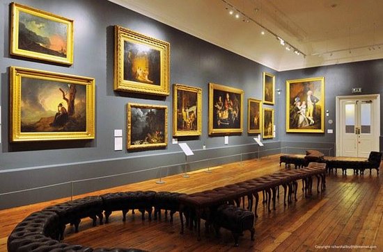
Joseph wright exhibition and collection, Derby museum
Today as a group we examined and discussed reasonable ideas to propose to the Derby Museum. The intention of this project is to attract people to the Derby Museum, with a given proposal. We first discussed the cost necessary and the space within the Joseph wright section of the museum. Overall the Joseph Wright exhibition, had a reasonably large room to work with. The first consideration is the wall colour. The colour at the moment is considered quite bland and doesn’t exactly go with the surrounding paintings. The other prospect is the location and distribution of the chairs. As you well know, the chairs are situated in a large element of the room. The group at first suggested, the possibility of removing the chairs, especially the amount of chairs. So therefore the space will be open up further. However, after this discussion, I pointed out that we needed to still keep some of the chairs, for people that can’t walk properly and others that just want to look at the painting.
Joseph Wright collection and exhibition, Derby Museum
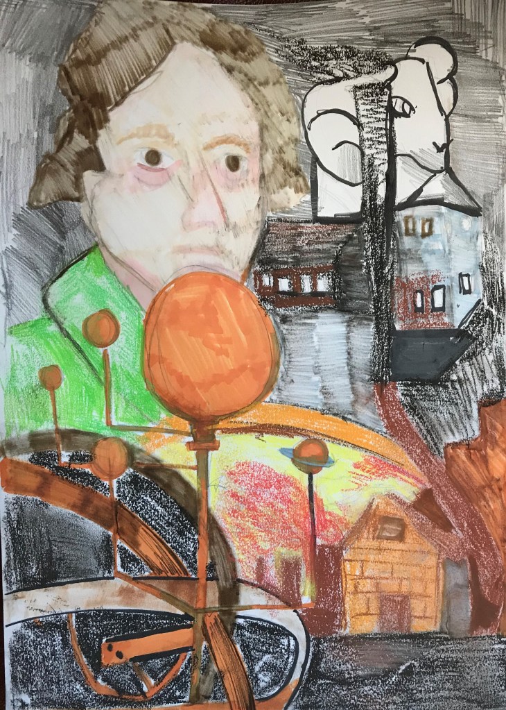
Throughout this group discussion, it was our intention to promote effective ideas with a reasonable cost. One of the ideas we came up with was a proposal to create an orrery out of wood, with interactive elements involved. Which personally would be very good with younger children, to explore and learn actively. However, as a group we still were looking at the cost. The next one proposed was an projection of an Orrery in the centre of the joseph wright exhibition. This idea was proposed by another person in the group. However I added to this idea further by allowing multiple buttons to reveal different sections of the Orrery with colourful and attractive elements. I also suggested the addition of sensors as another course of action. For example if you stand on one particular section of the joseph wright room it will reveal certain amounts of information and possibly audio.
The moon was another feature of discussion, for example how we wanted kids to contribute to the Joseph wright museum? By creating there own Orrery. I was going to mention the possibility of allowing kids to create their own planets of the Orrery out of paper Mache, as it is considered a low costing material. Or did we want a quiz, of Joseph Wright’s paintings, to encourage kids to learn more. I implemented further that perhaps the quiz, could involve a virtual setting, for example using Kahoot, as a cheaper alternative, as it is used more widely in schools and quite a lot of younger people do have access to a device. However this can be an addition to the paper form quiz.
Kahoot Logo
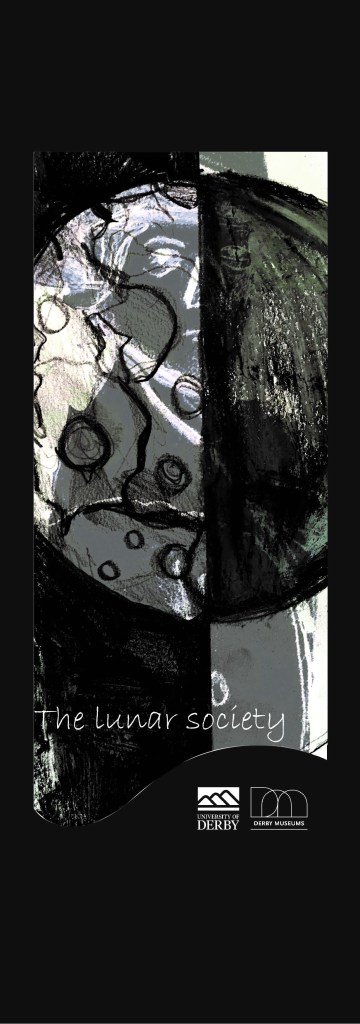
Next week we will discuss the research gathered and come to a full conclusion on which idea is the most suitable. Especially, in attributes to cost, size and material use. But until then, I was set the task on researching more about joseph wright throughout his time, especially within the lunar society. I have so far gathered research into who joseph wright was as a person, and how would this reflect the nature of his art. This is an association with the characteristics of him as a person, and how he identifies himself within his work. This will be an important, as showcasing why it will be more of himself, rather than just his paintings.