Throughout the connections module, we were encouraged to go to a design connections event organised by Debbie Longridge. The design connections event invited a variety of different illustrators, graphic designers and other creative design industries to the talk. Keith Cox from Block digital, Helen Day is the curator of the ‘ wonderful world of lady bird artists’, Victoria Hall from rare games and many other illustrators and designs attended the practice. We asked a variety of questions, concerning the importance of portfolios and the experience of working in an industry.
The event has greatly encouraged me to scope further into the design industry, specifically companies involved with books. I felt so encouraged to speak to some of these significant illustrators and designers, especially the ladybird books. The ladybird books, in my opinion was an important feature within the book industry from the 1960s to 1980s. My parents, reflect that ladybird books were so popular with children and contributed to the already growing book industry.
The ladybird industry set the foreground for printing professional and traditionally drawn book designs. The ladybird books still remain a classic towards children and adults alike, especially when the company started catering towards adults in late 2017. I personally admire and would love working for a company like the ladybird books. As I seek to align myself with continuing the traditional illustration. But I overall loved the people that attended. I am deciding this week, to ask questions and start to continue with working on my portfolio.
The Story of Nelson, published by ladybird book publishing Lawrence du Garde Peach (Author), John Kenney (Illustrator)
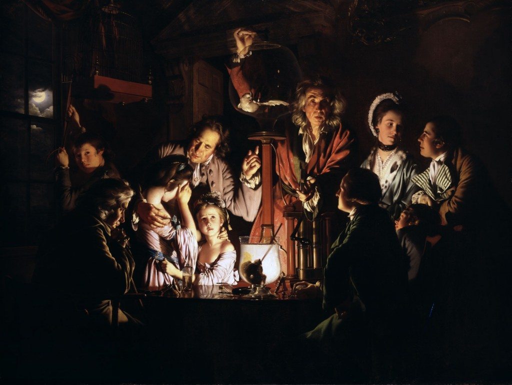
In the afternoon, we continued working on the other group project. My group have extended, there research and have added new ideas on how to make Joseph wright’s work be more appealing in museums. I was focusing on the different elements within Joseph wright’s paintings, especially the combination between light and dark. I compared it, to the colours seen in the industrial revolution. The other people within my group, were focusing on Joseph wright’s most famous painting ‘ A philosopher lecturing on the Orrery’, where we were considering constructing a virtual project of the orrery. Of course this idea is needed to be fully explored further, where we can include all are different ideas. Though I have to admit, I do like this idea, for our group project.
A Philosopher Lecturing on the Orrery, 1766 painted by Joseph wright
Throughout the illustration: connections course, we were encouraged to reach out to illustrators that I have admired to connection with. As you may know I have struggled with digital illustration; asking a digital illustrator has been helpful, with understanding the importance of embracing different features within illustration and hopefully encourage me to start practicing digital illustration. I do long to have the confidence of promoting vast amounts of digital illustration. Though it may take a while. Alexandra Francis is an illustrator and graphic designer based in Manchester. Alex’s work is subjected to digital illustrations of characters and editorials. I really love her choice of colour and tonal values throughout her illustrations. I want to thank Alexandria Francis for answering my questions. I really enjoyed reading them.
Culture trip Manchester illustrated by Alexandra Francis
Here is the email correspondence below. I hope you enjoy reading this.
1) why did you to become an illustrator?
Alex: “I studied Fine Art and at the end realised I didn’t want to be a Fine Artist! I soon discovered a course called Shillington which taught me Graphic Design. I loved combing my drawing skills with design and using my craft in a useful way for other people.”
2) what would you say to someone beginning a career in illustration?
Alex: “Don’t feel like you need to have a style or have it all figured out. This is a time to push, pull and experiment. Try lots of different techniques, see what you’re drawn to – don’t overthink it.”
3) which commission did you enjoy creating the most?
Alex: “Last year I worked with Ancestry to commemorate the anniversary of The Blitz, it was really nice to draw from historical records and have it inspired by my community in Manchester. Seeing my work on a billboard was a proud moment too.”
4) what is your typical working week?
Alex: “As a lover of routine, I stick to a usual 9-5 schedule. It most likely includes lots of client calls, proposals, sketches and listening to podcasts”
5) how do you begin to create your digital illustrations and did they improve over time? (Digital illustration is not exactly my forte)
Alex: “I always start with a thumbnail sketch, something so rough that only I can understand it but enough to figure out the composition and forms. My illustration has definitely improved over time, constant practice and absorbing inspiration has improved my knowledge of balance, composition and colour.”
Throw and Co – Textile store by Alexandra Francis
6) Do you usually get repeat commissions from people? How are they obtained?
Alex: ” Yes! It’s always important to give your client the best experience possible. Commercial illustration is a people-facing role, having good people skills will ensure your client feels happy at all times in the process.”
7) were there any illustrators or graphic designers who inspired you?
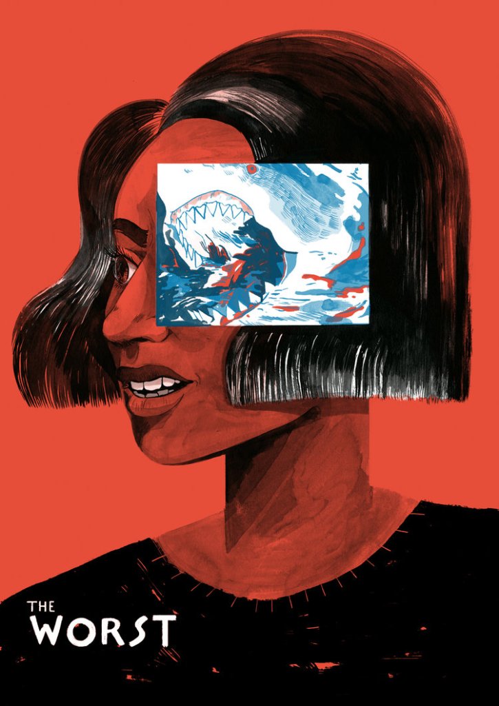
Alex: “I’m constantly inspired by illustrators and graphic designers, people like Laura Bee, Molly Mendoza and Sarah Beth Morgan.”
‘The worst’ – title (cover) illustrated by Molly Mendoza Drip for Drip, October Coffee cup edition by Laura Bee
8) what do you think are the advantages and disadvantages of being a freelance illustrator?
Alex: ” Being freelance means a lot of control, you decide which projects to take on, when you will work and how you will work. However this is also the downside, you have to illustrate, project-manage, client liaise and market yourself all at the same time.”
9) what lessons have you learnt from being an illustrator?
Alex: “Having good communication skills is just as important as being able to draw. If you can convince, explain and form relationships with clients then you’ll be able to build yourself a portfolio of clients who love working with you.”
Intercom editotial illustration, an introverts guide to collaboration by Laura Bee
10) how do you deal with a difficult client?
Alex: “Its easily to immediately feel annoyed but its often a misunderstanding that has made the client seem difficult. Trying to think logically about what from their perspective isn’t working helps. Asking someone else about their opinion can put things in perspective.”
From this correspondence, I have learnt from Alex, to continue to build essential connections with illustrators and continue to seek inspiration. I do admire Alex’s work extremely, and hope I can understand the lessons she learnt as an illustrator. The overall module has been exceedingly interesting to discuss. It was also quite amazing because I have looked up to Alexandria Francis for a while, especially the illustrations being created.
The Derby museum design sprint is an essential part of the illustration connections course. This of course means that we need to do a group project for the Derby museum. The group task is to propose a solution to raise the profile to the derby museum in the city of Derby. We need to take into consideration the suitable audience, behaviours and locations to raise the museum profile. Near the end of the 9th week, we as a group need to present a group proposal, to raise awareness to the public and give an ultimate decision on what will unite us as a group project. The Derby museum promoted an interesting video and virtual tour, that discussed what has been part of the exhibition. I do agree with variety of different artistic values of the derby museum, especially with the prospect of group working and accepting different creative disciplines.
Derby museum, virtual gallery
Firstly we discussed the value of museums in today’s world. In my interpretation, I think museums are needed for discussing knowledge and allowing us to examine artefacts more closely. Though in current age, museums are becoming less popular, and more likely associated with school trips. At least that is what experience is like for some people. The museums I tend to remember is the London history and Liverpool museum, those are ones that really caught my eye as appealing and engaging. The London history museum I remember well because of the giant t – rex as part of the exhibition. So in this brief, we need to take into consideration, the prospect of making it more appealing and encouraging a wide variety of people to visit. I still consider the prospect of art museums to be important in today’s culture, encouraging people to ask questions and interpret the different artworks value. However this is my interpretation.
As part of the design sprint we did examine the people that usually attended a museum. We discussed that older people tend to form a large majority of people that attended exhibitions, specifically art exhibitions. Acknowledging this drawback will be helpful in future exhibitions and planning our own for the Joseph Wright gallery. Obviously there are younger enthusiasts, interested in fine art. But this is only a small minority.
An Experiment with the bird in the air pump, painting by Joseph Wright
The derby museum set us a project of proposing a solution to attract more people to the Joseph wright gallery I have always admired Joseph wright from a young age, especially the chairoscuro elements in his work. Joseph wright is an painter based in Derby, whose known for being ‘the first professional painter to express the spirit of the revolution.’ His candle lit characters are extremely prominent within his paintings. In the group, we discussed who we are and what are specialities are in illustration or graphic design. It was quite interesting to observe, the different works of the graphic designers and examine their particular ways of working. So later this week, we need to investigate further Joseph wright and how we plan to connect are work within a group.
As a group we got along quite well, and hopefully this will be helpful in future development and construction of our proposal.
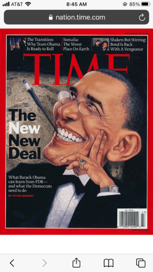
Throughout the connections module, we were encouraged to reach out to an international illustrator. I decided to do an email correspondence with C.F Payne, his answers were interesting to read and his perspective on illustration in America is quite remarkable. I first contacted him on the March 1st, for which he was very helpful with answering my questions. C.F Payne is an American illustrator and caricaturist, for which his work is commonly found on the Time, Sports illustrated and national geographic magazines. There are many others magazines he has done throughout his illustration career. His caricaturists are remarkably outstanding and create a sense of humour and identity with the characters. The Obama editorial is considered one of my favourites in relation to his work, especially since he exaggerated the proportions to make them seem over the top and quirky. I choose an email correspondence as an easier way to connect, rather than going through a online interview. For which If I decided to follow through with an online interview the different times zones would of needed to be taken into consideration, therefore deciding to take an email correspondence would be easier. I hope you find this interesting to read, here is the following email correspondence.
C.F Payne, Barack Obama editorial illustration for the Times
C.F Payne, book illustration
C.F Payne, Late for school book illustration
C.F Payne – Wind and the Willows adapted illustration
Why did you become an illustrator?
C.F Payne: “I became an illustrator because I like to draw. As long as I can remember, I liked to draw. I remember the drawings I did before I was in elementary school. That would be when I was 4 and 5 years old. I remember the drawings I did all the way through my early years. I drew so much, I got into trouble at school for not paying attention to the teacher’s lessons because I so focused on my drawings. After high school, I decided to go college to study art. When I arrived at Miami University in the fall of 1972 it seemed all the students were wanting to become abstract expressionists. The only place I found my home was in illustration.”
2. What would you say to someone considering a career in illustration?
C.F Payne: “Illustration has to be your passion. This means always learning about illustration and illustrators. There is such an amazing history to the art of illustration. There are so many artists to be inspired by and learn from just by studying their art. Get to know other illustrators working in your area, if you can find them. Talk to them. Listen to them. Learn from them. Illustration is a business that is always in a state of flux. Many of the jobs I had available to me in my early years aren’t there. Meanwhile, the idea of selling my art to someone in Spain or Ireland was not possible back then too. Now it is. Young illustrators are finding their own ways of dealing with the new markets, Again, this is why you need to get to know other illustrators.”
3. What is your favourite editorial piece that you have created for the times magazine?
C.F Payne: “I have two pictures that are memorable. The first is a Time Magazine cover that was about the Baseball Strike that was about to happen. Is it my best work? No. But, that picture had to be created from start to finish and delivered in less than one day. I got the call on a Friday afternoon while I was teaching at Syracuse University. The finished art had to be in New York City by early Saturday afternoon. It was the tightest deadline for a major publication I had to meet.”
C.F Payne: “The other image is the Barack Obama Inauguration cover because of the history of that moment. The deadline was tight as usual, but not as tight as the baseball image.”
4. How do you create your caricatures? How long does it take to plan and create?
C.F Payne: “I create my caricatures by simply drawing them out. They start as gesture sketches. If I could see the likeness of the person in my sketch, I knew I could get it in the tighter sketch. I find pushing the features in the sketch phase works best. Often it takes multiple sketches to get the one I like. How long does it take? As you would expect, some come fast, others can be a struggle.”
5. What is your least favourite brief that you have been given ?
C.F Payne: “I think the hardest jobs are the ones I can’t find something interesting to in the job and yet I know will take a great deal of time. Early in my years I had to take on jobs like that because I had bill to pay. It is not so much the case now.”
6. What is your typical working week like?
C.F Payne: “My work week now is different from what you may imagine. Yes, I am an illustrator. But, I am also the director of the MFA in Illustration Program at the Hartford Art School. The Hartford MFA in Illustration is the only low residency MFA solely dedicated to the art of illustration in the US. During this COVID pandemic, school has been very time consuming.”
C.F Payne: “My day usually starts around 7:30-8AM. I work in the mornings on my school duties, such as answering emails, reading papers or reviewing art. Later in the day, I try to find the time to work ono assignments. There are times, I have to turn down assignments because school now come first. My day usually ends around 9PM as I once again review my email to see if I need to address any student work or concerns. I work most weekends too. I try to keep it to either the Saturday or the Sunday, but not both.”
7. What is your favourite medium you enjoy working with?
C.F Payne: “I work a lot with mixed media. Acrylics are probably my dominant medium. I create my drawings with colored pencils.”
8. What would you consider your strengths and weaknesses in illustration?
C.F Payne: “My strength is people, my weakness are atmospheric things like complicated interiors or landscapes.”
9. Do you get repeat commissions from people? How are they obtained?
C.F Payne: “I used to get them when magazine publishing used my work a lot. Again, their deadlines are brutal, so at my age now I take very few, and only for a select few. Usually, getting those jobs starts when you get the first on and prove you can meet their deadline. The early jobs start small with small budgets. But, if you meet the deadline with good work, they usually reward you with more work. The deal is, you have to meet the deadline and they have to like what you have done. More recently I have done a number of children’s books because the deadlines are more reasonable and work better with my school schedule.”
10. Looking back on your life. Is there anything that you would do differently?
C.F Payne: ” Not really. I do wish I had gone to school at a time when illustration history was taught more. When I was in school, we had very little available to us. To learn about illustration, you really had to search. Most of it was self-initiated. Being self-motivated is still something you must be.”
11. Were there any illustrators you looked up to at the beginning of your career?
C.F Payne: “Early in my career I looked to Mark English, Bernie Fuchs, Alan E. Cober and Bart Forbes. Before college I liked comic book artists like Jack Kirby, MAD Magazine artists Jack Davis and Mort Drucker, and then in other magazines Norman Rockwell and the National Geographic artists of Tom Lovell and Stanley Meltzoff. After college, I found Maxfield Parrish, J.C. Leyendecker, Austin Briggs, Coby Whitmore, Wilson McLean and so many, many more. Now my lists are endless.”
12. Which caricatures have you enjoyed creating the most? Why?
C.F Payne: “I really don’t have favorites. I have subjects I like sports, entertainment and history.”
13. What’s it like being a freelance illustrator? Are there any advantages or disadvantages to this as a career?
C.F Payne: “The advantage is, you are your own boss. The disadvantage is, you are your own boss. The successes you own. The failures you own. You want to experiment on something new, you have to make your own time to do so. But, choosing to learn something new is your choice. When you choose to learn something new, is your choice. For me, carving out that time is easy because I like to learn something new.”
14.What is it like being an illustrator in America? (just curious, I’m from the UK)
C.F Payne: “Being an illustrator is a challenge. It has always been a challenge. The places where illustrators used to make great money have changed. But, it always has changed. Magazines aren’t a big a part of illustration as they were years ago. 30 years ago, the idea for creating art for video games never was something I could have done. The detail and creativity now is remarkable. Markets for illustration come and go.”
C.F Payne: “The key is to find the things you care about, the art you care about. Understand, you are creating art for someone else, a stranger you don’t know. That someone has to want to buy your art. Will it to be hung on their walls or solve a problem for their magazine, ad or package design. Will it be a children’s book? Will it be a poster?”
C.F Payne: “What all illustrators need to understand rule number one. You have to get good. Whatever art you create, it has to be good, really good. It also has to fit into the fashion of the times it lives and works. So work hard, draw well, design well, tell a good story and never stop learning.”
Overall, from learning the different experiences from C.F Payne, has been helpful in directing and shaping my illustration career. It has helped me consider the unique character attributes and the ways the characters are used to portray a message. I love creating new characters, and from delving from his experience of creating them, helped me consider what is deemed essential and interesting in an illustration career. I will certainty take his advice and learn more concerning the prospect of being a freelance illustrator. I can’t thank him enough for replying to my email.
This email correspondence has also helped me connect with illustrators internationally. It would of seemed impossible, if someone told me to talk to someone internationally before. So throughout the illustration course, I have definitely grown in confidence and considering different ways of applying my work.
Australian illustrator Nick Diggory is recognised for his outstanding characterisation and depicting scenes in ordinary day life. I discovered him recently, and needless to say I absolutely love his work. The Brexit illustration is considered one of my favourites from his work. Here is the link to his website. I want to thank Nick Diggory for his time to answer my questions.
1. Why did you become an illustrator?
Nick: “I was working in an ad agency back in the late 70’s and was nominated as ‘the illustrator’ whenever a job came in that needed some character creating. Maybe I was the only one in the studio that could actually draw! I was doing so much freelance work on the side, I thought I’d see what it’d be like to work for myself and whether or not I could actually make a living out of it.”
2. How long does it take for you to create a character?
Nick “From reading a brief to first draft can be anything from half an hour to half a day. Some days it just flows, other days, not. A lot depends on the brief. Some clients know exactly what they want, others give you a free hand which is always more fun.”
3. What do you enjoy most about your illustration career?
Nick: “I can work from anywhere. After going ‘digital’ in the 90’s, I moved to Australia. I left there a couple of years ago and travelled around Europe in a motorhome. Now I live in south west France. I’ve been lucky enough to keep most of my clients wherever I’ve been residing.”
4. What would you consider your weaknesses and strengths in illustration ?
Nick: “Weaknesses – I get bored easily, so I don’t like projects that last more than a couple of days. Also, the kettle is always tempting me away from the Mac! Strengths – I never miss a deadline. I know the pressures that people working in ad agencies and publishing houses are under, so when they give you a deadline, that’s when they want the job for. My work ethic is, early is on time, on time is late and late is unacceptable.”
5. Looking back on life, is there anything you would do differently?
Nick: “No. Quite happy with the way things have turned out.”
6. Which books have you enjoyed illustrating the most? Why?
Nick: “It’s nearly always the last one I did. I’ve just finished a promotional book for an insurance company in Canada based on real quotations from the CEO’s mother! Odd but fun.”
7. How long does it usually take to get a book cover ready for completion?
Nick: “Anything from a long day to a week. It’s much quicker now with computers, but ‘back in the day’ it would normally take about a week. Then you’d have to send it by post to the client and keep your fingers crossed that it actually arrived.”
8. What advice do you have for people starting a career in illustration?
Nick: “Be prepared to burn a lot of midnight oil, never, ever miss a deadline and never give up!”
9. Throughout your illustration career, was there a time when you struggled to get commissions?
Nick: “Many. When I started illustrating, there were only a couple of hundred of us doing it in the whole of the U.K., so work was plentiful, fees were higher and word of mouth spread easily. It’s easier to advertise now, but there of literally millions of other illustrators to compete with.”
10. Is there a particular medium you enjoy working with more than others ?
Nick: “All digital now. I wouldn’t say I enjoy it more than the traditional methods, but it’s a lot cleaner and a hell of a lot more convenient.”
11. Which illustration projects are you most interested in?
Nick: “Characters. That’s really what I do best and that’s been the mainstay of my work for thirty odd years.”
12. How do you start working on a new project?
Nick: “Still a pencil and a sketch pad.”
13. How do you obtain commissions from people?
Nick: “Word of mouth generally, or they may see my work online. I also have a couple of agents that come up with some great work.”
14. What would you do if a client rejected all drafts you presented ?
Nick: “Not much you can do really. Occasionally the client changes the brief half way through a job and the new brief might not be suitable for me. Sometimes they’ll offer a rejection fee. Often not. You just have to suck it up and move on.”
15. What lessons have you learnt from being an illustrator?
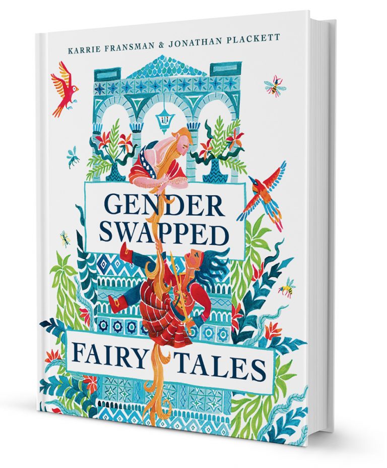
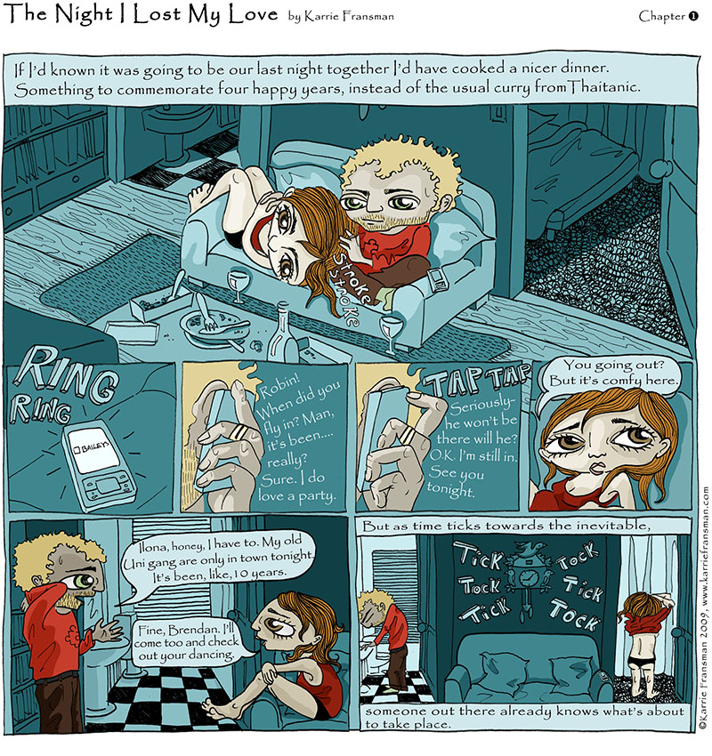
“Everyone can draw comics and create worlds.” Karrie Fransman is an UK illustrator and artist, specialising in comic book creation, such as the gender swap fairy tales and death of the artist. Karrie Fransman’s work is incredibly interesting, as she discussed that she isn’t subjected to one form of storytelling, such as working for the telegraph and being invited to Belgium to create a story based there. This could be from book covers to illustration pages to pages within a graphic novel. Another remarkable point to note about Karrie Fransman is that she doesn’t focus on one particular medium or particular style for her work. I believe this statement has been helpful with my current ways of working, as throughout the connections course, the idea of must trying to find your personal voice, has been overwhelming to say the least. So the prospect of choosing a wide variety of styles and voices have appealed to me.
Gender Swapped by Karrie Fransman The Times Comic, the night I lost my love by Karrie Fransman
Karrie’s lecture at the University of Derby has been incredibly interesting and insightful. From her role as a beginner graphic novelist to now working on new and interesting projects, has been completely inspiring. The first part of the lecturer discussed her early years as an illustrator, from teaching herself and finding companies she could work for. What I do love about her work is the gender swap fairy tales, the whole concept behind this is the genders of fairy tale characters are completely swapped over. For example one of the fairy tales was handsome and the beast, this completely revolutionised how we see gender in the 21st century. I love her interesting take on gender equality throughout her book, especially the association of different genders and roles. Karrie Fransman is not subjecting her gender storytelling to male and female, but instead giving more representation of different genders on a wider field. Her association with storytelling allows this to be more interesting and intriguing in the present society.
The second part of the lecture, Karrie focuses on the different elements of storytelling within a narrative. Karrie gave examples of artists and illustrators who provided an effective narrative, works including the wrong way by Brecht Evans. Who uses decorative blocks of colour to provide an interesting and insightful narrative. The colour in the illustration represented the different personalities of people within the work. For example the red blocks of colour represents that those particular characters are extremely bold and bright. Whereas the grey character is seen as plain and considered unsocial. I do agree with Karrie Fransman that the use of colour is effectively displaced correctly throughout the work. The consideration of page layout is also an important element for displaying an effective narrative. An example that Karrie Gave was the gigantic beard that was evil by Stephen Collins. I do love how Stephen Collins effectively uses narrative within his own advantage. The use of texture and where the line sits on the page allows the narrative to flow more easily and at a greater advantage. The colour choice is quite simple, yet effective, in portraying a dark and sinister story.
Karrie Fransman uses these examples, to then discuss the important elements of storytelling. The invisible ink by Brian McDonald has been helpful in giving continuity and direction to storytelling. Brian McDonald summaries the main devices within a narrative. The first part of the narrative, which Brian deems essential is the once upon a time, every day or until one day as a starting point. This helps provide context within the storyline and gives the viewer time to understand what the particular narrative will be about. The next part is the ‘because of this’, which can be used to develop the story further and add a greater interest. The element is the finally, which develops into a climax. Then leading towards the end of the story called the ‘ever since that say’. I believe that his direction of storytelling is essential for illustrators, artists and even writers. Though storylines don’t tend to always follow the exact narrative. I still believe that Brian Mcdonald’s is helpful with turning my own story into an effective narrative.
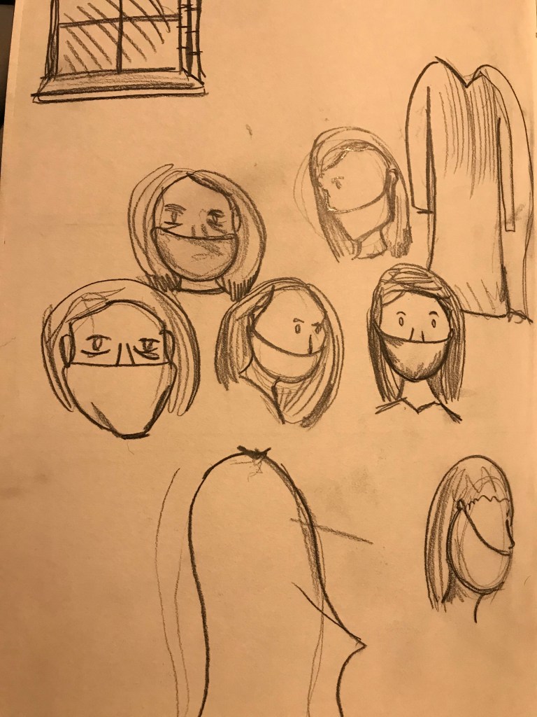
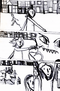
At the end of the talk, Karrie Fransman discusses the main objectives of the brief. Karrie Fransman’s brief responds to living in Lockdown. The brief’s objective is to give a illustration narrative of a character that we have seen or imagined during Lockdown. My village is personally quiet, but I have noticed that there is a ginger cat that has been annoying my dog throughout the village. I thought this could easily respond to lockdown, as I kept the feeling that the cat, was living in perfect freedom, allowed to go outside and roam free. Whereas his ‘humans’ had to stay inside. For the main element I decided to go with a graphic novel. As I do particularly enjoy portraying a narrative in this way. Here are the sketches below of my previous cat sketches. The other idea for the graphic novel is to create a graphic novel of someone traveling to work in there daily life. But gradually becoming more tired and hopeless. But by the end, of the graphic novel people announce that everyone is vaccinated – and are finally free. to go out the house. Of course at this moment, everyone is still facing tighter restrictions. I just hope that people would find hope in it. Of course this does not mean that everything will be back to normal.
Jessica Hall, Sketchbook work of my character Jessica Hall, Sketchbook work my character Jessica Hall, part of the visual narratives brief. trying to practice with digital ( not exactly my forte)
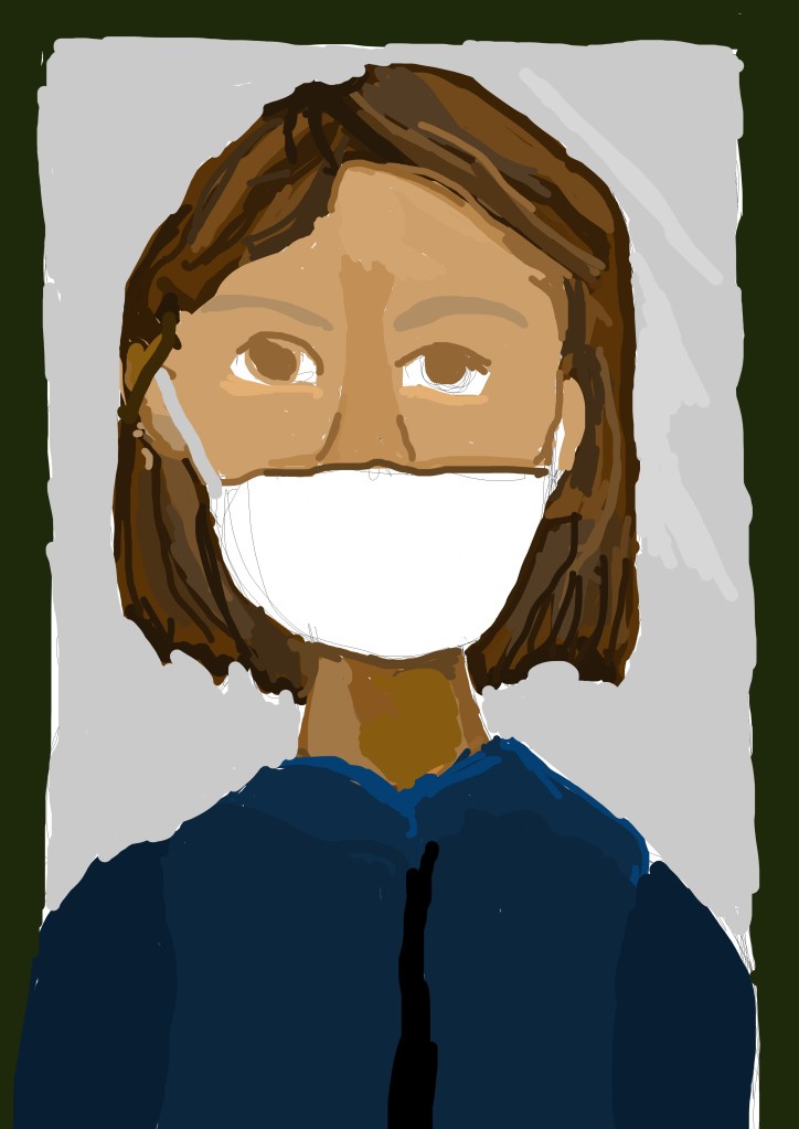
At the start of my particular brief I focused upon doing rough sketches of my story. The story represents the doctors and nurses putting there life on the line throughout the Covid 19 pandemic. In this story it is my intention to portray them as heroes. It is personally based on an imaginary character of a nurse stabbing Covid with a sword. Personally, throughout this pandemic, I am looking forward to a day when Covid is completely gone from society. (I know it will be here for a while) And looking foward to a day when people celebrate in the streets, when Covid is gone from society. Of course I know that Covid will be with us for a particularly long time, I just wanted to produce an illustration that represented my hope for the future.
Here are the sketches below.
Jessica Hall, Sketchbook work
Here is my final
My take, on the karrie Fransman brief Part 2, of the Karrie Fransman Brief
Throughout the Illustration: Connections module we needed to contact an illustrator through an online interview, email correspondence etc. Owen Davey is an award winning illustrator based in the UK, for which he is known for his characters, such as lord of the Hafflings and illustrating children’s books. He was absolutely lovely to talk to and his responses to the questions were quite interesting. I contacted illustrator Owen Davey at the beginning of February and scheduled an online teams interview on the 18th of February. And despite the connection and recording issues, we managed to have an interesting conversation. I can’t thank him enough for scheduling time, so I could interview him. It was incredibly interesting to hear his experiences, through being a freelance illustrator and the different projects he has worked on. Below are sections of the online interview, of course I just put the questions and his answers. I hope you find it interesting to read. Here is the link to his illustration website: Owen Davey Illustration
Owen Davey, A safari inspired notebook image created for Djeco
Me: So Why did you become an illustrator? Who inspired you?
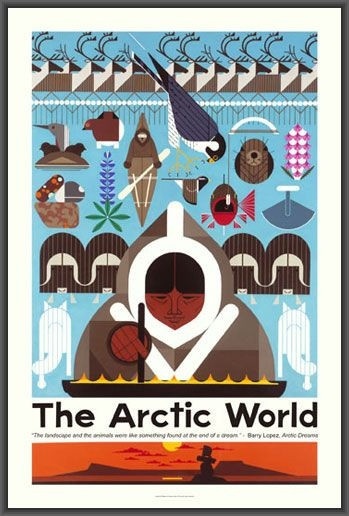
Owen: “So the why is literally because I like drawing, that’s all I have ever really done. Its just, yeah it was always the thing I enjoyed doing, whenever I had a bit of downtime I just draw and so I was like how can I turn this into a job. So that’s all it was really and kind of deviated from that. In terms of inspiration, it’s just loads and loads of things. When I was a really little kid I used to love getting a computer games magazines and copying characters out of that. As I kind of got older, I got exposed to more and more different people and different things. And, if you have a little look through my Instagram, the people I follow that’s often a good place. Then there’s people like Charley Harper and Dahlov Ipcar, good luck spelling that one.”
Charley Harper, Artic world, The – poster
Me: I just got Charley Harper
Owen: “Dahlov Ipcar’s stuff is really cool, its there There’s bunch of people to be honest, I’ll send you a little list if you like. Of some of the people that inspire me. I’ll make a note of that.”
Dahlov Ipcar, Caribou and wolves
Me: What is your favourite piece of work?
Owen: “What of my own work, or some one else.”
Me: Yeah your own work
Owen: “its usually the most recent thing I have done and then overtime I grow to hate it. Not hate it, but grow to like it less. The about books I have done with flying eye books, there like these non- fiction books about animals, each one is each kind of type of animal. I have just finished doing my seventh one of those, which haven’t been released. But each one of those, I kind of ones I’m very proud of. Yeah the obsessive with octopuses, which is the most recent one I’ve done, which I guess. I don’t know it changes every day. Sorry it is really a rubbish answer.”
Me: It’s fine
Me: How do you overcome a creative block? So I am at university at the moment and it Is kind of hard to come up with new ideas.
Owen: “I found uni quite hard in some ways aswell, because you set your own briefs. But when you start becoming a professional illustrator your getting briefs from other people. So that side is removed from you, which is quite useful. Because when I am just working on my own stuff, it can get quite … I do struggle as well. So usually I just go to the brief for my inspiration. I do get creative blocks. But then basically I usually have a few different projects on at once. So if one of them I am feeling creatively blocked, I’ll try to move on to one of the other ones. If I’m having a day when I’m crap at drawing. I’ll try and do some research instead or there’s all that kind of stuff with running a business as well. I just got to make sure I keep doing stuff basically and yeah sometimes I just need to take a break. That’s all it is. Usually I try a different angle or try something different.”
Me: How do you keep track of your work that it gets done on time?
Owen: “I have a little. I keep it quite simple actually, I know people that do it really organised. I basically just have a little word document that I always have open, whenever I turn on the computer. I turn that on and it has the name of the project, when the drafts are due, the finals are due and just make sure I am keeping on track of that. That’s it really. I know there are some people that do like, they assign specific times to different things, I like to keep it more organic than that. Because sometimes I feel like working on some things, sometimes I don’t.”
Me: What do you think are your greatest weaknesses in illustration? or strengths ?
Owen “So I struggle with hands. Hands are really hard to draw. Not make them sausagy”
Me: I’m glad I’m not the only one
Owen “I think hands are really hard. Feet are difficult as well. Both are tough. So I keep finding ways. I don’t know I’m getting better with hands. I keep working at hands, just to try and get better at them. Strengths I think are colour, people seem to like my colour and use of shape so. I think I am quite good with designing, like designing how something looks. I’ve got a c**p line, actually, my line is awful. It’s not awful, its too confident, which is really annoying because like unconfident lines are interesting and confident lines are. I don’t know other people’s line are better than mine, I don’t like my line. So I try to stay clear of that. But I think I can design a character quite well. I can look for shapes within it and find something more interesting than straight drawing it. That might be one of my strengths.”
Me: What is the weirdest briefs that have ever been set?
Owen “Yeah I have to draw strange things quite regularly that’s one of the things I love about the job. It means that I’m constantly having to research stuff that I’ve never heard about before. Im actually struggling with an answer for this one. I’m just looking through my through my years of work. I am trying to think of something that grabs me. I mean Usually the weirdest things are more like, its usually about how the work is being used that’s kind of weird. I designed an umbrella, which is quite a weird one. That was really fun”
Owen: ” One of my least favourite things I had to do, and is quite weird and annoying. So because I do books which are then published in different countries. These about animal books that I do. One of them, got published in, the first one, the monkey one got published in France and they decided to change the cover themselves. Using my artwork, but didn’t show it to me at all. Just printed it how they wanted it. And I hated it. And I do hate it and I’ve told them I hate it. But the problem is they wanted other books from me as well. And they want them to be in keeping with the first book they printed of mine. So I’ve had to do versions of my covers like their style, which I hate. Which, that’s quite a weird one. That sucks. They pay me for it but I hate doing it because I don’t like the way they approached it. So it’s a bit soul destroying every time I do it.”
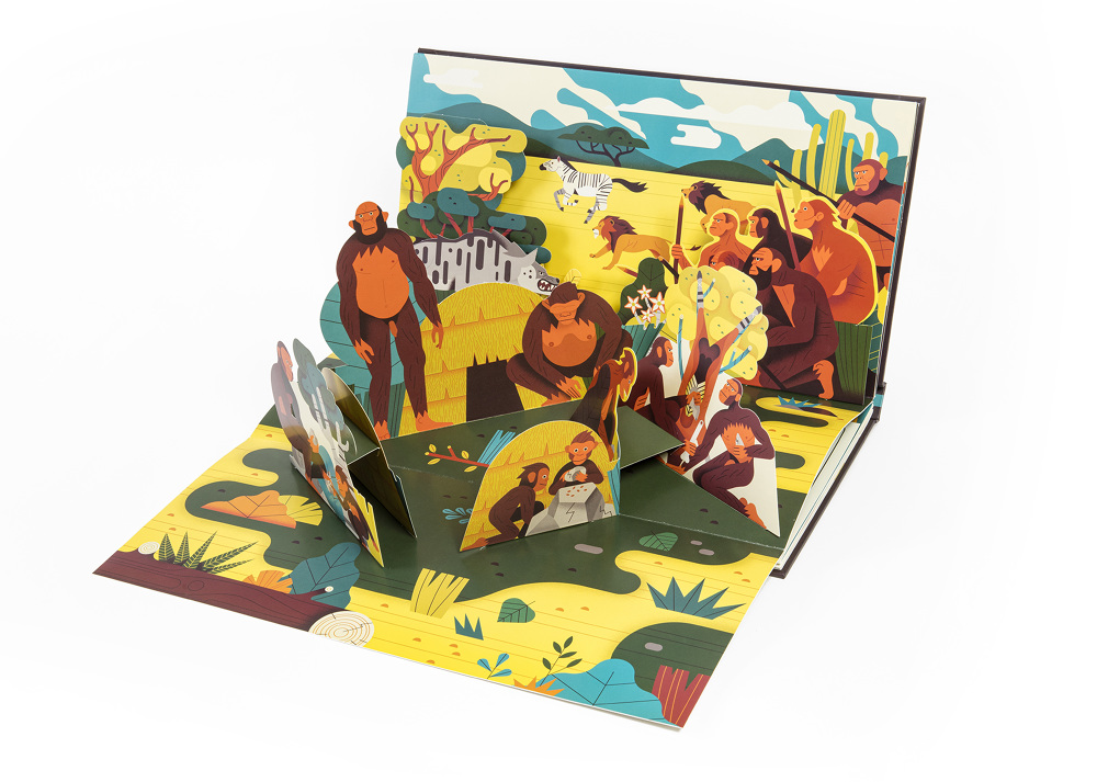
Me: Apart from that what would you consider your favourite books you have illustrated ? Apart from the French one
Owen: “The about books are definitely are kind of up there and I also did a pop up book called Prehistomania. It’s a French book but its like a pop up one, insane amount of work because I had to do the front and back of each one of these things. Each page has loads of different pop up bits on it. Also because it was non – fiction, I had to do so much research as well, I didn’t actually write it, but I still had to look up what everything looked like. Things. But I was really proud of the result. People seem to really like it.”
Owen Davey, Prehistomania
Me: How do you see yourself in five years’ time?
Owen “I don’t. I hope I exist still. Yeah it’s something I’ve never done. A lot of people do it. I don’t bother thinking that far ahead because I don’t think you can plan life. So unexpected to be a f***ing pandemic. Which has messed all our lives up. That’s the kind of prime example. I just go with the flow. I like drawing, as long as I can keep drawing that’s my plan. To still be an illustrator in five years. It’s my plan for also 50 years.”
Me: How do you know when the project is finished.
Owen: “When the client pays me. No I mean working with clients you do, you have them as a fall back for them saying it’s done. But creating the imagery I just keep fiddling until when I make little edits, it makes it worse. That’s kind of my point. Usually it creeps up on me. Oh I have a little bit of work left to do on it. Then I’ll do something ‘oh right yeah it’s done. Then I will send it to a client, we usually have a little bit of feedback that often picks up on things I might not have spotted or something because you get too close to your work when your doing it. So clients are quite useful in that respect. But they can also really f**k it up if they have a different aesthetic thought pattern to you then sometimes they can just, they can make it a direction, you really don’t want it to go. Which is not so fun. But most of them make it better. ”
Hello, fellow illustrators, here is the second part of the email correspondence between me and John Coulthart. As an illustration student learning different styles and processes, John Coulthart has greatly helped me influence how to apply and consider the ways I could possibly work in. The reason part 2 is included throughout this blog page, is because I was concerned for the word count and thought it would be possibly easier for the reader to continue reading.
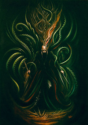
John Coulthart’s work has inspired me to look further even into the premise of digital art and even considering graphic novels. Here is some of John Coulthart’s illustrations and comic book art that have greatly influenced my ways of working. I particularly love HP Lovecraft, Graphic explorations of the Cthulhu and the Lord of horror, the nightmare on history. Here are they below.
John Coulthart, HP Lovecraft – Graphic explorations of the Cthulhu Mythos John Coulthart, Lord Horror – The nightmare of history
Here is the second part of the correspondence below.
6) Me: What do you feel are your greatest strengths and weaknesses in illustration?
John: “Figure drawing has always been my weakest area so it’s the area I tend to labour over more than others. I used to think this was because I hadn’t gone to art school but having worked in comics for several years it’s obvious that many artists have a natural aptitude for figure drawing, just as other artists have a natural aptitude for cartooning or drawing caricatures. My natural aptitude is for architecture and the rendering of solid forms, especially through shading. I love Piranesi’s etchings of Roman ruins, and any kind of engraving and textured rendering. I’m also pretty good at imitating or pastiching a variety of different art styles; I like the challenge of trying to work in a different style. I also have a good sense of composition which is an important thing for cover design.”
7) Me: how do you see yourself in five years?
John: “In five years I’ll be 64, like in the Beatles song, although I certainly don’t feel that old. When you get to this stage of your life you’re usually happy for things to continue as they have been doing, and to stay healthy and productive. Things are different when you’re younger, changes happen much more frequently. From the age of 20 to 35 I seemed to be changing direction every five years or so: doing album covers and T-shirts for Hawkwind, then adapting Lovecraft stories into comics, then working for UK and US comics companies, then working for US games companies. Soon after that I got a computer and started migrating my working methods from physical media to digital art. For now I’m enjoying working on books, inside and out, so I hope this continues. I’d also like to be getting more of my private work into the world. I have some plans in this direction.”
8) Me: How do you get approached by people asking for commissions?
John: “I don’t have an agent for my artwork—I’ve tried them a few times but they never seem interested—so I make a point of being easy to find and to contact. I’ve had my own website for almost 20 years now, and I have an uncommon (Scottish) surname so I’m easy to locate when people are searching for things. Having a durable web presence also means that my work turns up even in searches where people aren’t intentionally looking for my art. Consequently, I get many commissions from people who’ve found my work by accident after they’ve seen a cover on Pinterest or somewhere.”
9) Me: Do you get repeat commissions from people?
John: “Yes, thankfully. I have a good relationship with a handful of publishers who like what I do and ask for more.”
10) Me: What is your least favourite illustration project? (you don’t have to answer this question)
John: “Many years ago I was asked to illustrate a fantasy book for a small publisher, and was dismayed to find that I didn’t like the book at all. I persevered for a while, and drew a couple of lacklustre pieces but eventually told the publisher I was abandoning the project. This was bad behaviour on my part, I think now I could have done something with the material. A couple of years later a similar thing happened with a mediocre horror novel which I did illustrate to the satisfaction of author and publisher but I wasn’t very pleased with my work on the book at all.”
11) How do you overcome a creative block ?
John: “I never seem to suffer from a block as such but I can occasionally be stumped for which direction to go in. When this happens I don’t spend too much time worrying about it, what I do instead is start with whatever seems the best option then find out how that goes. This is more of an issue with design work than illustration, since design has different priorities. Illustration is only a problem if, like the fantasy book that I didn’t like, I don’t feel inspired. Something I often do in either case is think “How would X approach this?”, with “X” being another designer or artist or illustrator whose work I like. This seems to be effective because the work that you like excites your imagination in a manner that your creative problem may not be doing, so you circle round the problem for a while then come back to it feeling energised by your enthusiasm. It’s not a question of imitating somebody else’s approach in the final work, it’s more to do with stepping into somebody else’s shoes for a moment to see if this makes you see the problem from a different angle.”
12) Me: What inspired you to create the Lovecraft adaptation covers?
First edition Oneiros Books (1999) Introduction by Alan Moore. The Haunter of the Dark. The Call of Cthulhu illustrated by John Coulthart
John: “All the Lovecraft work I’ve done over the past few years has been a result of having adapted two of Lovecraft’s stories as comics in the 1980s. These eventually formed the core of my first book, The Haunter of the Dark, in 1999. In 1985 I’d decided that I’d done enough artwork for Hawkwind’s album covers, and wanted to do something that was completely different. I’d been reading Lovecraft’s stories for many years, and was surprised that there wasn’t much illustration based on his work apart from the covers of the book themselves. I chose the comics medium because you could essentially illustrate an entire story this way, rather than one or two scenes. I dislike superhero comics but I used to read Heavy Metal, the US comics magazine, where the strips were much more interesting and art-oriented than the superhero comics. In the late 70s Heavy Metal also published a Lovecraft special which once again made me wish there was more work like this around.”
“Lovecraft is an important writer because he hauled the horror genre into the 20th century by throwing out the Christian background of the supernatural, and blending horror with science fiction, littering his stories with references to Einsteinian physics, Futurist art and so on. He also had a great enthusiasm for architecture which appealed to me, and which you still don’t see reflected so often in illustrations of his work. People tend to focus much more on the monstrous elements, especially Cthulhu, which is one of the few Lovecraftian deities with a defined appearance. There’s something very attractive about the phrase “cosmic horror” although it’s a sub-genre which can be difficult to illustrate. This creates challenges you don’t get with other forms of horror. How do you represent para-dimensional gods or alien creatures and the millennial time-spans they inhabit? How do you represent the truly alien and unhuman? These kinds of questions keep me coming back to Lovecraft’s stories.”
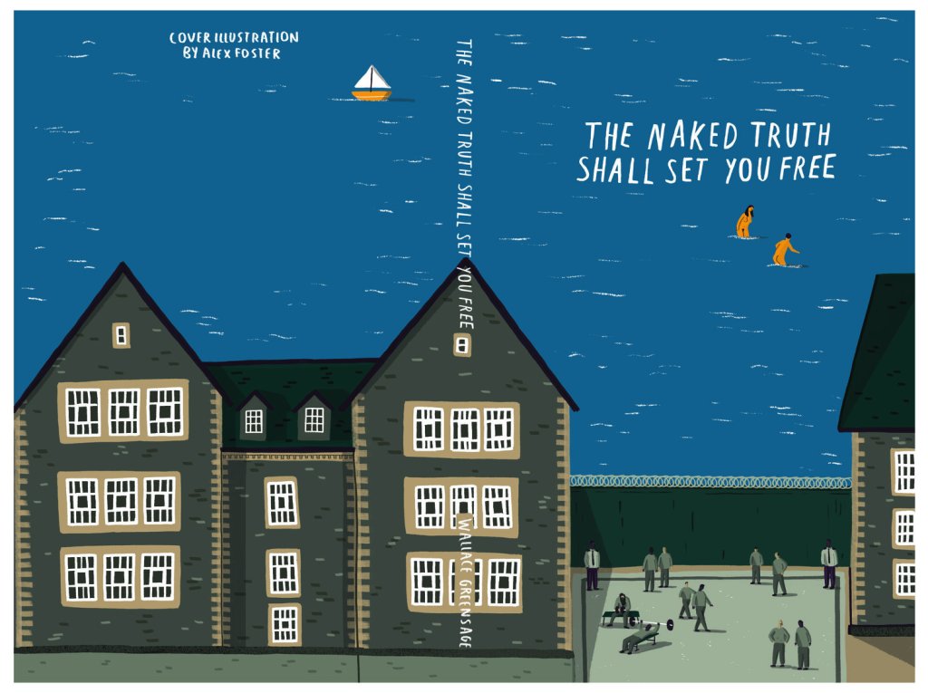
Illustrator Alex Foster is based in Margate and works with children’s book illustrations and maps. Alex Foster’s work is celebrated for being a prominent figure in children’s book illustrations and magazine editorials. His editorial and magazine illustrations have become popular with adults and children alike. One of my favourite Alex Foster’s editorials is the River Road and national park map for the Texas highway magazine.
Texas Highway Magazine River Road & Big Bend National Park map – Alex Foster
As part of the illustration module, we needed to contact illustrators either via email correspondence or an online interview. I contacted Alex Foster via email correspondence and he was very helpful in answering all the questions I had. Below is the email correspondence with Alex Foster. Here is Alex Foster’s website: Alex Foster (alex-foster.com)
Me: Who inspired you to become an illustrator?
Alex: “My first inspirations I guess were artists making gig posters, that being the first time I’d really experienced illustration. I looked at them and thought I’d love to make stuff like that, and wanted to know how to get there. Dan Mumford and others I can’t remember the names of!”
2. Me: How do you overcome a creative block ?
Alex: “Sometimes with deadlines creative block isn’t available to have as weird as it sounds – if there’s no time you just have to get on with it. Usually though for me I don’t get much creative block because my illustration is usually for a specific purpose/brief so there isn’t too much creative freedom anyway. But if I do get it I’d try different ideas, if they aren’t coming I’d go for a walk or do something unrelated, hoover, read or something.”
3. Me: What is your favourite work in your portfolio? Why was it made?
Alex: “One of my favourites is the Art Rebels project, because it was for my local gallery that’s been hugely important for the area (Turner Contemporary in Margate), and it’s got an element of learning and fun – the cards give prompts to inspire kids or whoever is using them to make artwork in various ways.”
4. Me: What’s the weirdest briefs you’ve ever been given?
Alex: “I wish I had more weird briefs! A lot of the time everything has to be very safe and unoffensive (makes a lot of sense with children’s work) but sometimes it’d be fun to draw some silly stuff.”
5. Me: What do you think makes a good illustrator?
Alex: ” I think skill comes easier to some than others, but my work doesn’t come easy to me and I think a good illustrator needs tonnes of perseverance, with something like drawing you don’t get good in a few days, it takes constant practise.”
6. Me: What is your least favourite commission?
Alex: “Least favourite commission is anything where the client takes too much control and doesn’t let you do your job. Most of the time feedback is good and helpful and can make the piece better, but too much interfering or too many rounds of changes will just ruin any good work.”
7. Me: what are your strengths and weaknesses in your illustrations?
Alex: ” This is a tough one, it’s something you need to evaluate constantly I think. Maybe a weakness is that due to me not wanting to turn down jobs I’ve got loads of different work in different areas in my portfolio, this isn’t necessarily bad but who knows I might be a master of one subject if I stuck to one thing (editorial or children’s books for example). A strength is that I always schedule out my time well and don’t stay up late working even with crazy deadlines.”
8. Me: How do you see yourself in five years time?
Alex: “Five years hopefully I’m more picky with projects to take on, ones that are good for my future and not just because I need the money.”
9. Me: how do people come to you for commissions?
Alex: “I think at this point it comes from everywhere, some from Google ads and searches, some from Instagram, some from recommendations or graphic designers knowing/finding me to work with. Knowing this in more detail is very important vecause then you can push those areas”
10. Me: What interests do you have besides illustration?
Alex: “I like playing Pc games (sometimes Minecraft, a new one called Valheim, enjoyed Cyberpunk for the main story), I like reading – just started ‘Status Anxiety’, read loads of Stephen King. I love films and good Tv Series. Lots of walking. Cooking. Watching UFC. I watch Limmy on Twitch a lot. Youtube. Did love the pub with mates when that was the real world!”
The New Albion’ series. One of three book covers illustrated by Alex foster (author Wallace Greensage)
The aspect of choosing a digital correspondence has been important with connecting with other illustrators. Asking the question on how to overcome a creative block, is a new question I have decided to ask, the premise is that I have always struggled to find inspiration and developing new ideas. However, using what he suggested within the method of distraction, if struggling with a creative block. Would definitely be something I would take on board in the future. In future email correspondences and interviews, I will ask more questions regarding other illustrators work in practice, and gathering information on how these illustrators became, who they were today.
As part of the illustration module, we needed to contact different illustrators for the blog page. British graphic artist, illustrator and author John Coulthart, as created the most phenomenal pieces of illustration and art. Through his imagination, colour and obsession with the unknown. I first contacted John Coulthart in early February, thoroughly concerned that I might not get a response. However he did respond, and answered my questions, for which I can’t thank him enough. Here is his website: { john coulthart }
Hi Jessica,
Here are my answers to your questions. I hope you find them worthwhile. If you have any follow-up questions then that’s okay. I’m still busy with things but some of the panics of the past two weeks are now under control.
Thanks,
John
—
illustrated by John Coulthart, Lovecraft illustration
Me: Why did you become an illustrator?
John: “It was something I was always gravitating towards in my teen years. I was interested in fine art from an early age thanks to my mother who had been to art school, and still had a few books and art magazines around the house. But the idea of being a fine artist, making art solely for galleries and the people who frequent them, was never very attractive. I was reading adult fiction—mostly horror and science fiction—from the age of 12 on, and the covers of the books stimulated my imagination. Image plus text: that was always an exciting thing. Chris Foss ruled the science fiction covers at this time, you’d go into W.H. Smiths and see a whole wall of his art on display; book shops were like miniature art galleries in this respect. I was about 13 or 14 when I drew a couple of pictures of spaceships that were poor imitations of the Foss style. Despite the shortcomings of these drawings my friends at school were impressed, a reaction that in turn impressed me, and made me want to do more of the same. Soon after this I got my parents to buy me Views, the first book of Roger Dean’s work as an illustrator and designer of record covers. I immediately forgot about Chris Foss and started drawing many poor imitations of Roger Dean’s art. The success of Views had prompted Dean to publish more books of imaginative art under his Dragon’s Dream imprint so I started collecting these when I could afford them. Several were by artists whose work I knew from the covers of books I’d been reading, people like Bruce Pennington and Ian Miller. Around the same time (the late 1970s), New English Library published Visions of the Future, a book that recycled cover paintings and artist profiles from NEL’s large-format magazine, Science Fiction Monthly. Each profile contained details about the artist’s education and work to date, together with a few quotes. The most important thing for me about all these publications was that they confirmed that illustration was a viable career, and one connected to the kinds of fiction I enjoyed reading.”
2) Me: What kind of illustration projects are you most interested in?
John: “Anything to do with horror and fantasy on the whole. I still do science fiction work now and then—I’ve just done the cover and interior illustrations for a collection of stories by Bruce Sterling—but my imagination seems to work better in other areas. I also like subjectsthat are a little offbeat in some way. I’m not one of what I call “the dragon painters”, people who do very typical fantasy art in oils or acrylics. I can do straightforward genre themes if necessary (and I used to paint with acrylics) but I prefer it if the subject isn’t so typical.”
3) Me: What are the weirdest Briefs you have ever been given?
John “Probably the books edited by Ann and Jeff VanderMeer. Jeff has a very quirky sense of humour that often generates unlikely book ideas which he somehow persuades people to publish. In 2003 we collaborated on a big story collection, The Thackery T. Lambshead Pocket Guide to Eccentric and Discredited Diseases, for which I had to find (or create) many old and unusual medical illustrations, as well as design the book to imitate many different print styles. Ann and Jeff followed this in 2010 with The Thackery T. Lambshead Cabinet of Curiosities, a book that required more unusual illustrations and graphics. Then there’s their short KosherGuide to Imaginary Animals which tells you which fantastic creatures are okay to eat if you’re Jewish and happen to find any edible fantastic animals. This was a humorous book that wasn’t intended to be insulting. Ann is Jewish, and helps run her local synagogue so she knows her subject.”
4)Me: What interests do you have outside of illustration?
John: “Reading, obviously, but I also listen to music almost all day, every day. I’m something of a music obsessive, I have several thousand CDs, and love to listen to music while I’m working. I’ve also collected films for years, first on tape, then DVD, now on blu-ray. I have rather eclectic and often obscure tastes when it comes to cinema so even though many films are available today via streaming a larger proportion of them aren’t at all. I don’t watch much new Hollywood fare, I’m usually watching old or new foreign films, or older films in general, going back to the silent era. Blu-rays for me are a dream come true, giving you the ability to see previously scarce films in high definition any time you want.”
“I also chip away at private projects when I have the time. I’ve written two novels which publishers have found “uncommercial” so they’re still unseen. These are part of a larger project based around an invented city which I created to be a setting for work in different media.”
5) Me: What is the work you are most proud of? why?
John: “I don’t know if I feel proud of anything as such since I can often point to flaws in almost anything I’ve done, minor things I wish I might have done better which I’m sure most viewers wouldn’t really bother about or even notice. But if you’re creating art of any kind then you’re usually aiming at a goal of some sort, even if the goal isn’t very well-defined or is only recognised as such after you’ve reached a certain point. I’m pleased to have two books of my work out in the world, and I’m pleased that some of my covers led to my being given a World Fantasy Award for best artist. I’ve often been dismissive of awards in general, but I changed my tune about the World Fantasy Award when I saw that some of the previous winners included artists who inspired me when I was younger.”
Overall, from this interview, I have learnt about the premise of being a freelance illustrator and how to overcome different challenges within the illustration agency. The interests outside illustration was also an important feature throughout the conversation. As we can spend too long focusing all energy on illustration itself, when in reality taking breaks is quite important. The questions I asked was quite simple, but overall I am interested on how the illustrator has developed a sense of style, and discuss later the application within my own work.