Graphic design and band manager Ian Cherry, also known as Chezza gave an interesting online lecture at the University of Derby. Ian Cherry previously worked for branding and advertising at a variety of football clubs. He explained that working for these football clubs were the most significant thing throughout his career, especially since he always had a love for football. Ian Cherry graduated from the University of Derby in Vis Comms: Graphics design and Communication. Chezza acknowledged some questions interesting statements throughout his presentation, including “when you get towards the end of your degree don’t get too caught up in the work that you are doing, make sure you focus as well, what’s going to be the first step in your career.” Which honestly is remarkably good advice and helps demonstrate reasonable confidence and preparation for the future. I will definitely take this advice later on within developing my illustration career. He “first started looking at the different career opportunities out there, I’m talking about geographically, financially” This is remarkably true, because in the future there could be instances where we need to leave comfortable locations, and find areas that are more accessible geographically and financially. The financial aspect is also essential factor for a career in illustration or graphic design.
Ian Cherry has created branding for Real Madrid and the Scottish professional football league design from 2015 onwards. Other teams he has worked for his Hull city and the Derby County Community Trust. Here are examples of his designs below.

Ian Cherry discussed his life and works after graduating from the University of Derby in product design throughout his lecture. His impact on the football industry, particularly logos are outstanding and provides advice of the different stages within his development. It is not to say his time has been difficult, he addressed going through the loss of his dad and moving to different locations. His advice was helpful, especially to accept your ideas, even though people might disagree. For which I completely agree, it is hard in today’s industry, because there will always be people that have a different creative flare than you. Needless to say his advice was interesting and hopefully I would be able to do a successful attempt towards his set brief.
We took this lecture as part of our Illustration: Connections course with the graphic design students. I overall found this lecture extremely interesting, especially learning about the different professions to the one I am aiming for. However next week another illustrator will attend the session and set us an allocated brief. So this first brief we need to approach it, like the graphic design students. Whereas next week we will focus on the brief set by a different illustrator.
Overall I loved the lecture, it helped me confirm some things I was concerned over in the design industry. The questions that were asked by the class addressed my own queries concerning the design industry. I did agree to, joining a creative workshop in the near future, which will be helpful in clarifying the different associations with typography. I find what he had to say extremely interesting and helpful. I hope I can give his brief some justice and hopefully it will be placed to a high standard.
I decided to focus the brief on the Vintage Sports Car Club and design a logo for this. I chose the Vintage sports car club because I do love classic cars, as me and my dad went to many classic cars shows. I decided to focus the main picture of an overlap of different classic cars, to hint at the acceptance on the variety of cars at the club. With the words on top. The other sketch, I was deciding between was a helmet sketch, though the words will be slanted and surrounding the helmet. It will be a quite difficult to discuss, through I hope I come to a positive resolution. I decided whilst creating my logo, to look at what people have done in the past. The current logo uses a rounded cursive typeface, which is quite simplistic. Similarly with other sports club logos, it appears very simplistic and old fashioned. I decided to make a typeface appear quick, by slanting the words.
The next part of the progress focuses on the development of the car logo. I decided throughout creating the logo, to focus on one particular car with the logo on top. Here is the sketch below. My final logo is the last image.

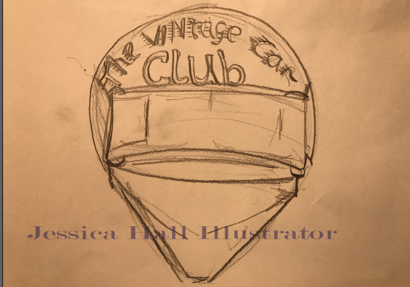
As I continued I started experimenting with colour choice, for the brief. I personally loved creating this logo. Though I must admit that this is not exactly my forte. I will possibly improve this and seek a positive resolution. I felt that the helmet sketch logo wasn’t as successful as the car logo, So I decided to go with the one above. I hope I improve my technical skills to give some improvement within the narrative.
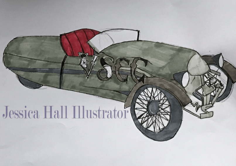
This is my final sketch, and is honestly a more successful attempt. I decided to produce this work in illustrator , as it provided the greater contrast between the different elements in the logo. I tried to stick with a car design, through the empathises of the car wheels. If I had more time I would probably do a coloured version
